BRAND GUIDELINES
This is a guide to the basic elements that make up our brand. It will let you get to know us better…
Best to have a checklist. Then you know that you have done everything right.
01 – The Logo
Only use logos that are complete and in an appropriate version, created from original digital artwork. Please check that you have respected the minimum size and exclusion zone requirements.
02 – Backgrounds
The logo should not appear on light or cluttered images without being reversed out.
03 – Graphics
Check that any supporting graphics or graphic elements do not marginalize, obscure or overpower the Network logo.
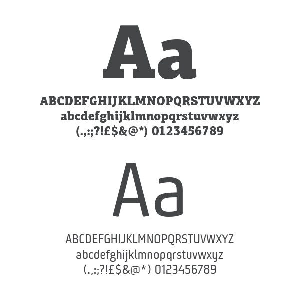
04 – Typography
Check that our corporate typefaces have been used appropriately where applicable.
05 – Design
Be sure to provide these guidelines to third parties or collaborating partners.
A final thought
If in doubt, take a look back through this document, all the answers are there.
We don’t ask for much, just a little love and respect for our branding which is why we think we’ve created a flexible system that won’t stifle your creativity.
Give it your best shot…


